We've standardized the layout of Source Details pages within Feedback across Emails, Surveys, and Video Calls.
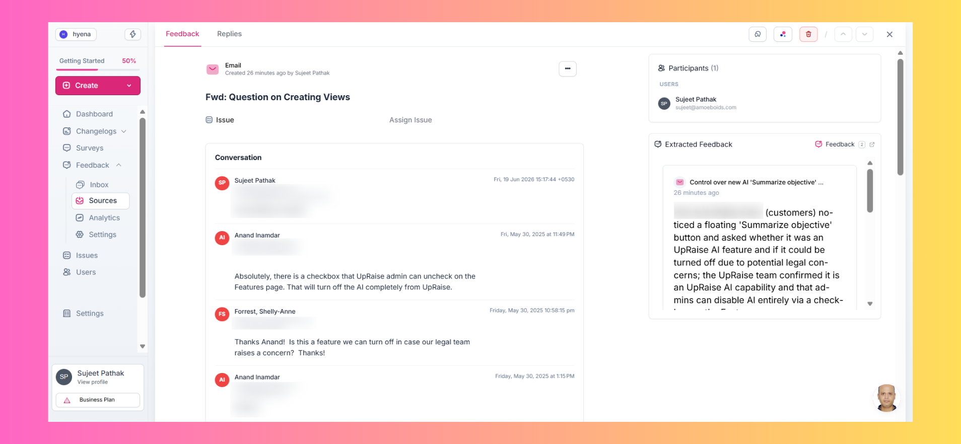
Common elements now appear in consistent locations:
Participants and extracted feedback on the right
Title and conversation content on the left
This makes it easier to navigate different source types without relearning the interface each time.
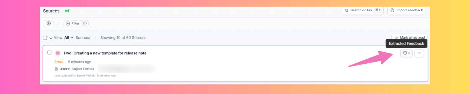
✨ Sources Page, Decluttered
We've cleaned up the Sources experience by removing redundant UI elements and reorganizing others into more intuitive locations.
One handy addition: you can now click the feedback count directly from a source card to open the extracted feedback list in a new tab — no need to open the source details page first.
🎥 Better Video Import Experience
We've improved the video import workflow to provide clearer visibility into what's happening behind the scenes.
You'll now get better indications of processing stages such as Transcribing and Extracting Feedback.
We've also fixed a few issues, including:
Videos occasionally playing a previously viewed recording
Timestamp links on extracted feedback not jumping to the correct point in the video
A smoother experience from upload to insight 🚀.
🔌 Integrations Page, Polished
We've made a few small improvements to the Integrations page to reduce unnecessary clicks.
For example, clicking an integration card now takes you directly to its details page — no need to hunt for a separate View Details action.
Small changes, smoother navigation.


